Matrice Brand Guidelines
Turning brand guidelines that were never shared into a platform where every rule comes with the tool to apply it, no designer needed.
- Client
- Matrice, internal
- Role
- Head of UX/UI
- With
- The art director
- Deliverables
- Platform, design system, kit
A growing team, diverging materials, and brand guidelines left sitting in a folder.
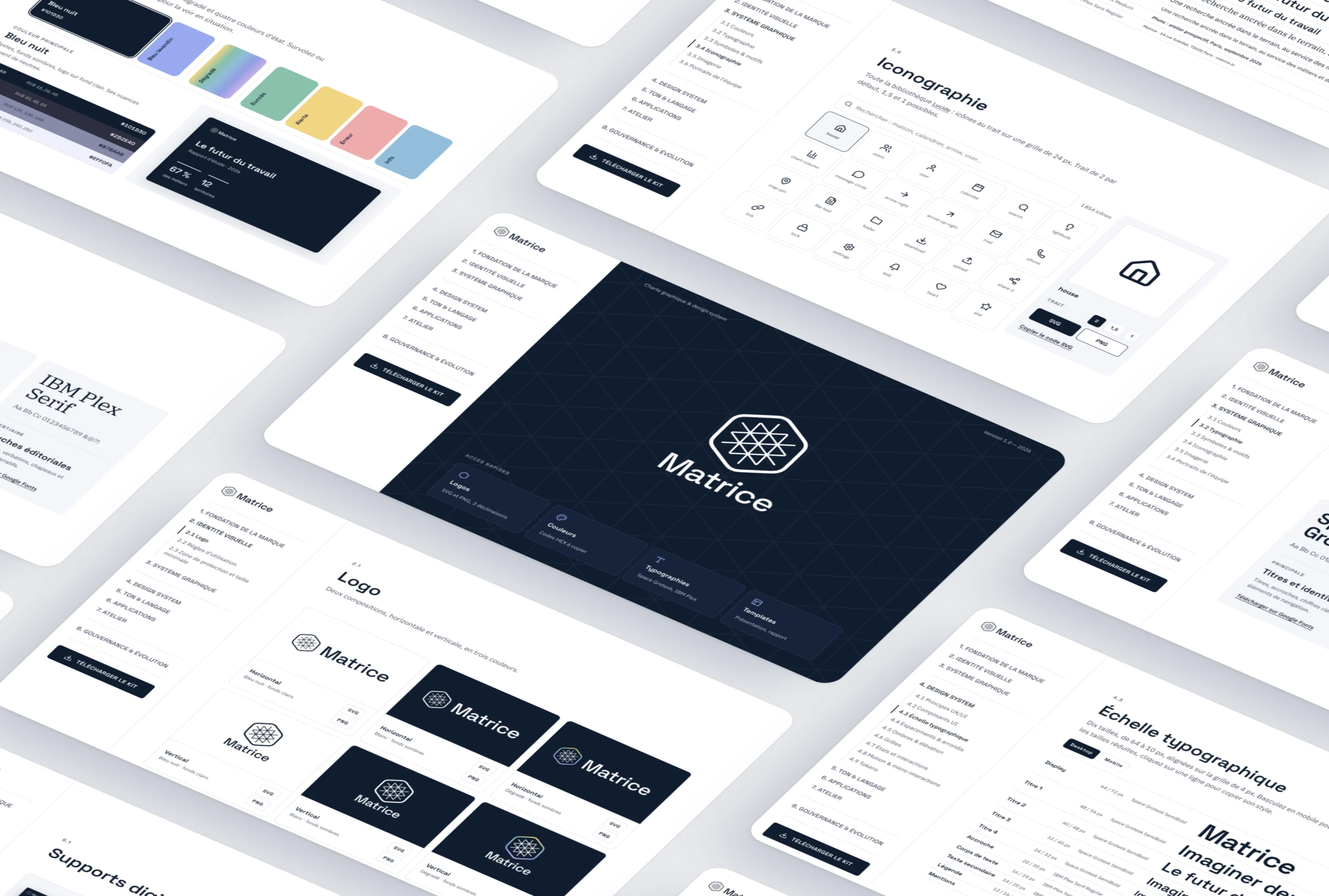
A web platform where every rule ships with the tool to apply it.
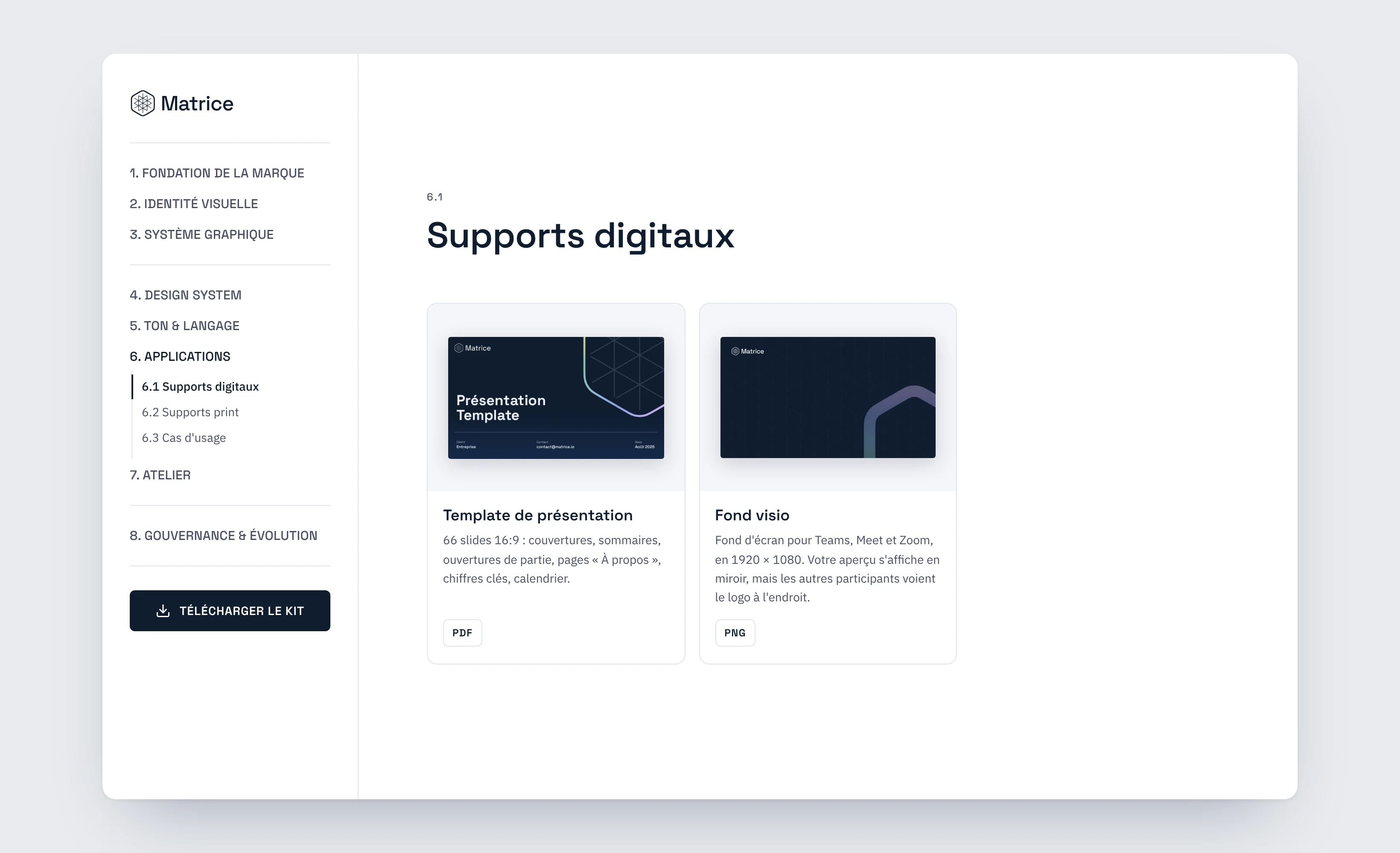
8 chapters, a creation studio and 74 ready-to-use files, used without a designer.
A growing team, diverging materials.
Matrice is an innovation institute bridging social sciences, research and foresight. As it grew, the team multiplied its materials with no shared reference. A first set of guidelines existed, but had never been presented.
Several versions of the logo in circulation
Colors picked case by case
Inconsistent documents
PDF guidelines end up forgotten. We needed guidelines people actually use.
What the brand is, and what it isn't.
Before any visual, five personality traits, each set against the pitfall to avoid. They guide everything, down to the tone of messages.
We tell stories of the future and offer desirable narratives in the face of dystopias.
Futuristic or prophetic.
We favor reuse, repair and reorchestration over radical disruption.
Disruptive or nostalgic.
Our studies happen in situ, as close as possible to the world of work.
Theoretical or detached.
We bring researchers and artists together to shed new light on every question.
Decorative or elitist.
We look at what technologies actually do to our societies.
Technophobic or techno-solutionist.
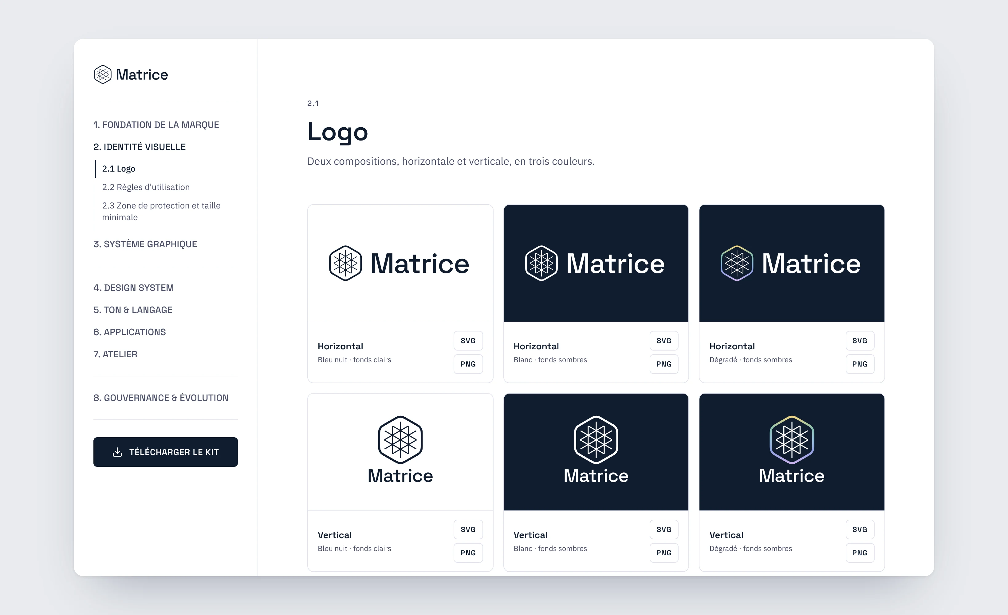
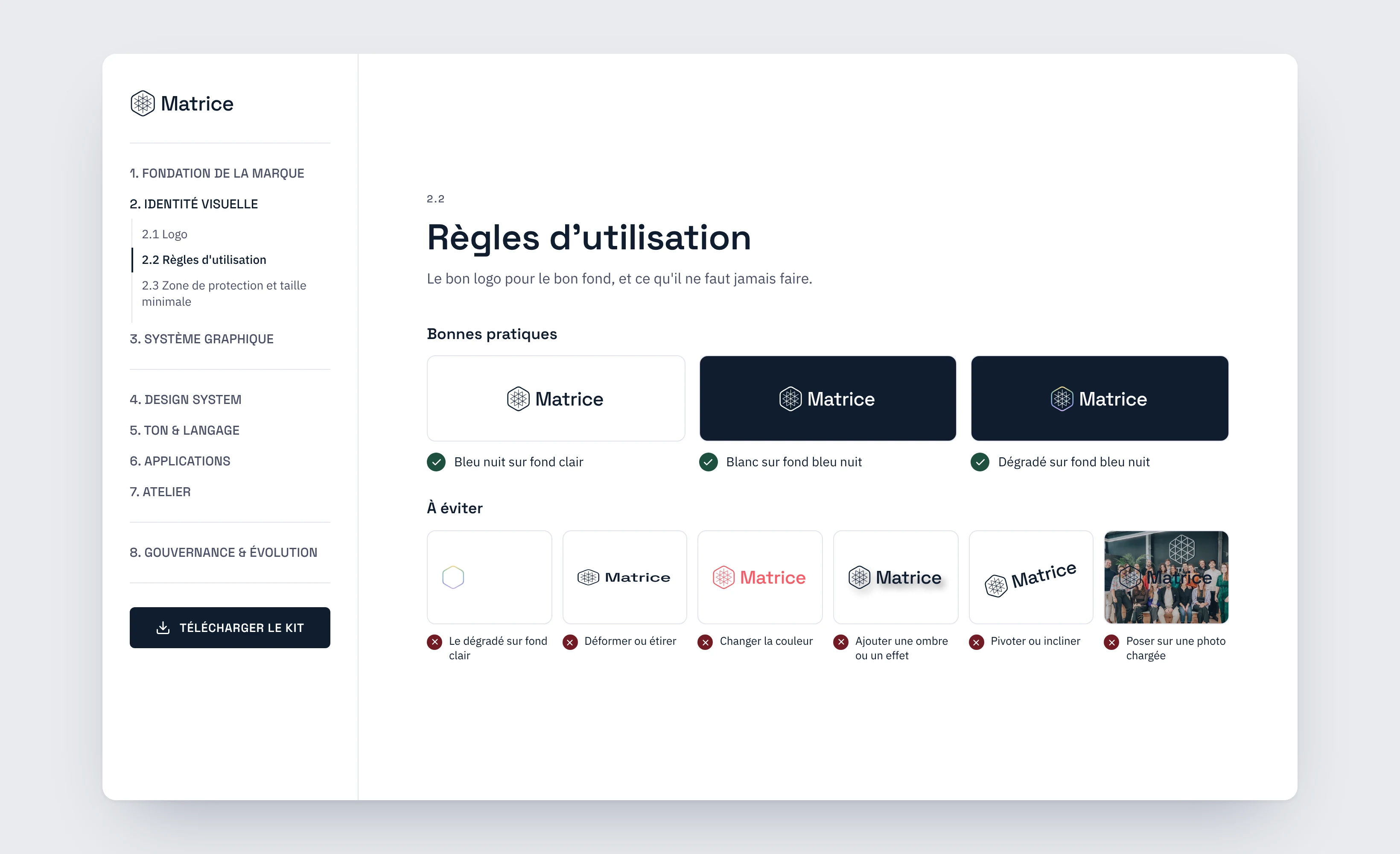
Showing the rule by example.
The logo can be downloaded in every version. Rules are learned through good uses and common mistakes, not paragraphs.
Colors, typefaces, icons.
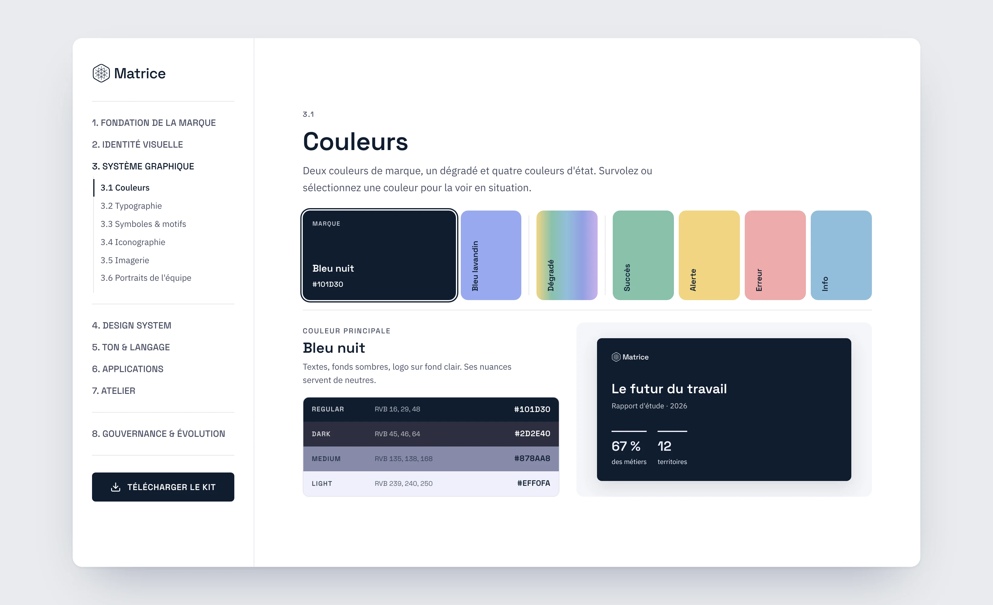
a main midnight blue and ten hues in four shades, copied in one click
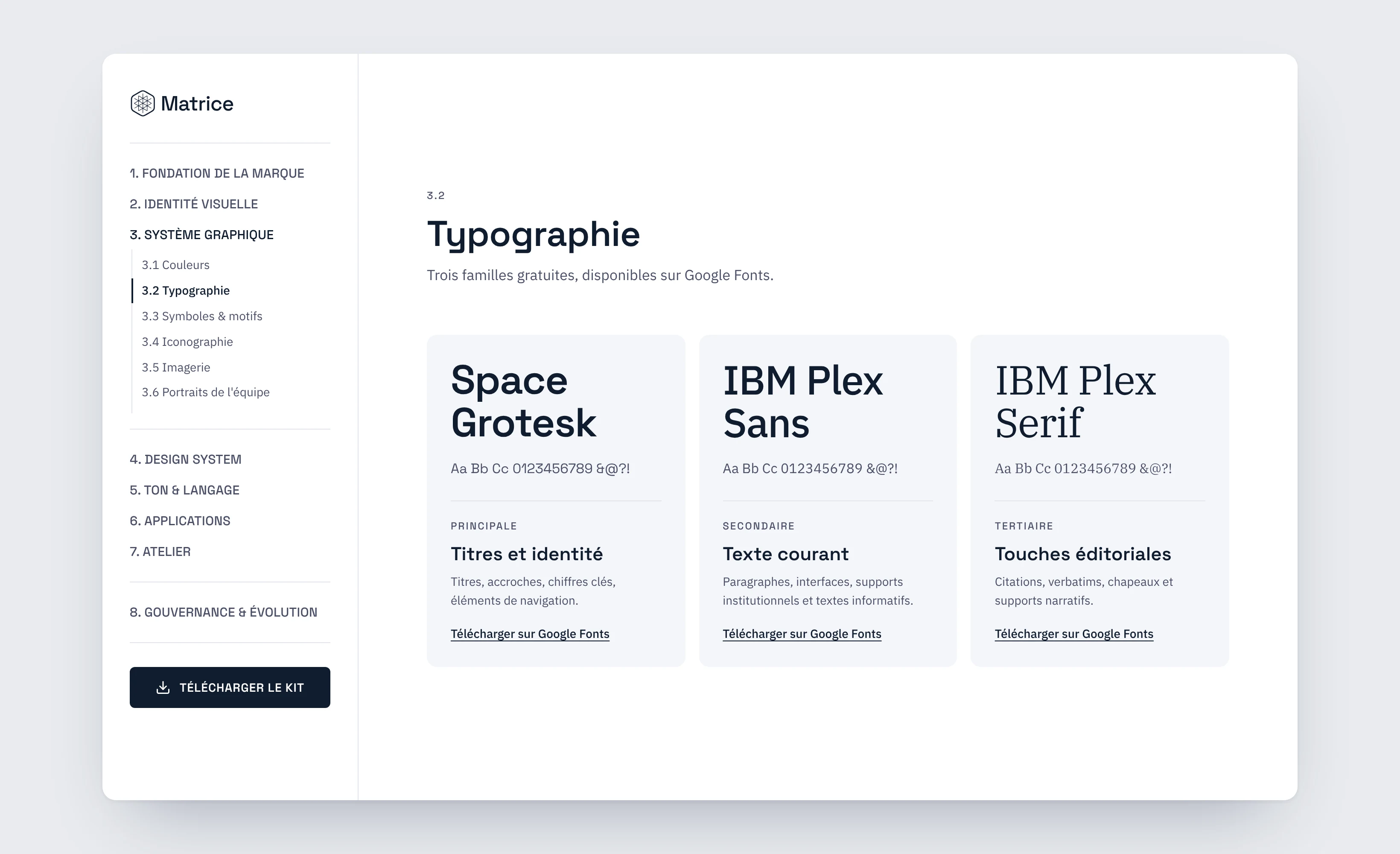
typefaces, each with a role: headings, body, quotes
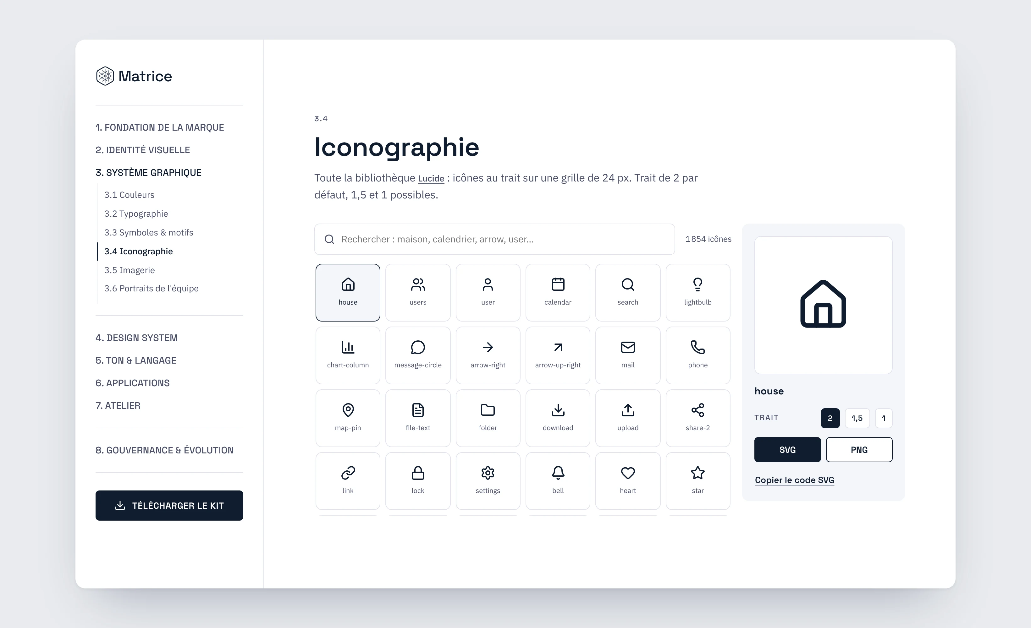
Lucide icons, searchable in French and English
Foundations for future products.
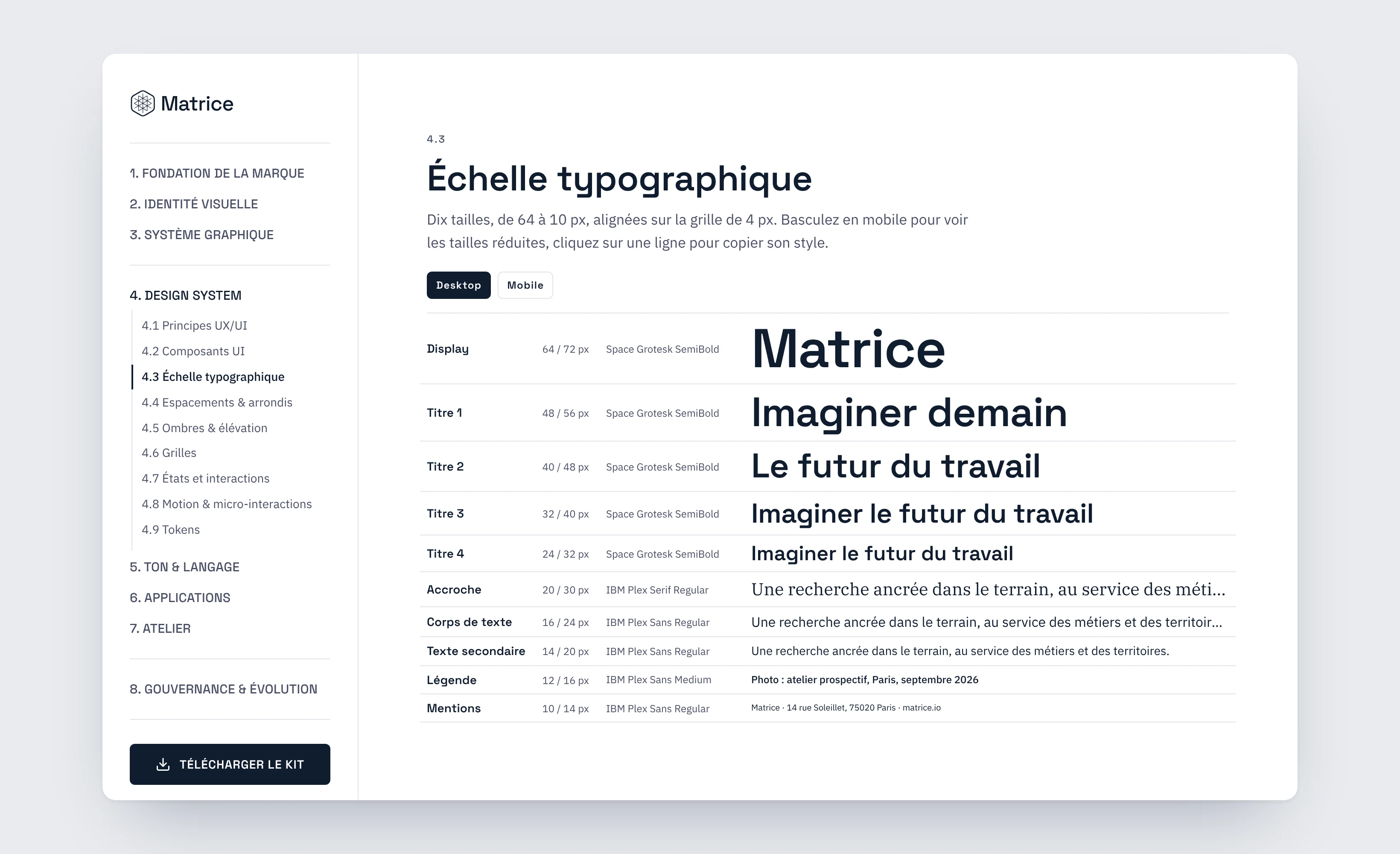
text sizes, from 64 to 10 px, with their mobile values
the base of the spacing scale, with 4 corner radii
Creating visuals without design software.
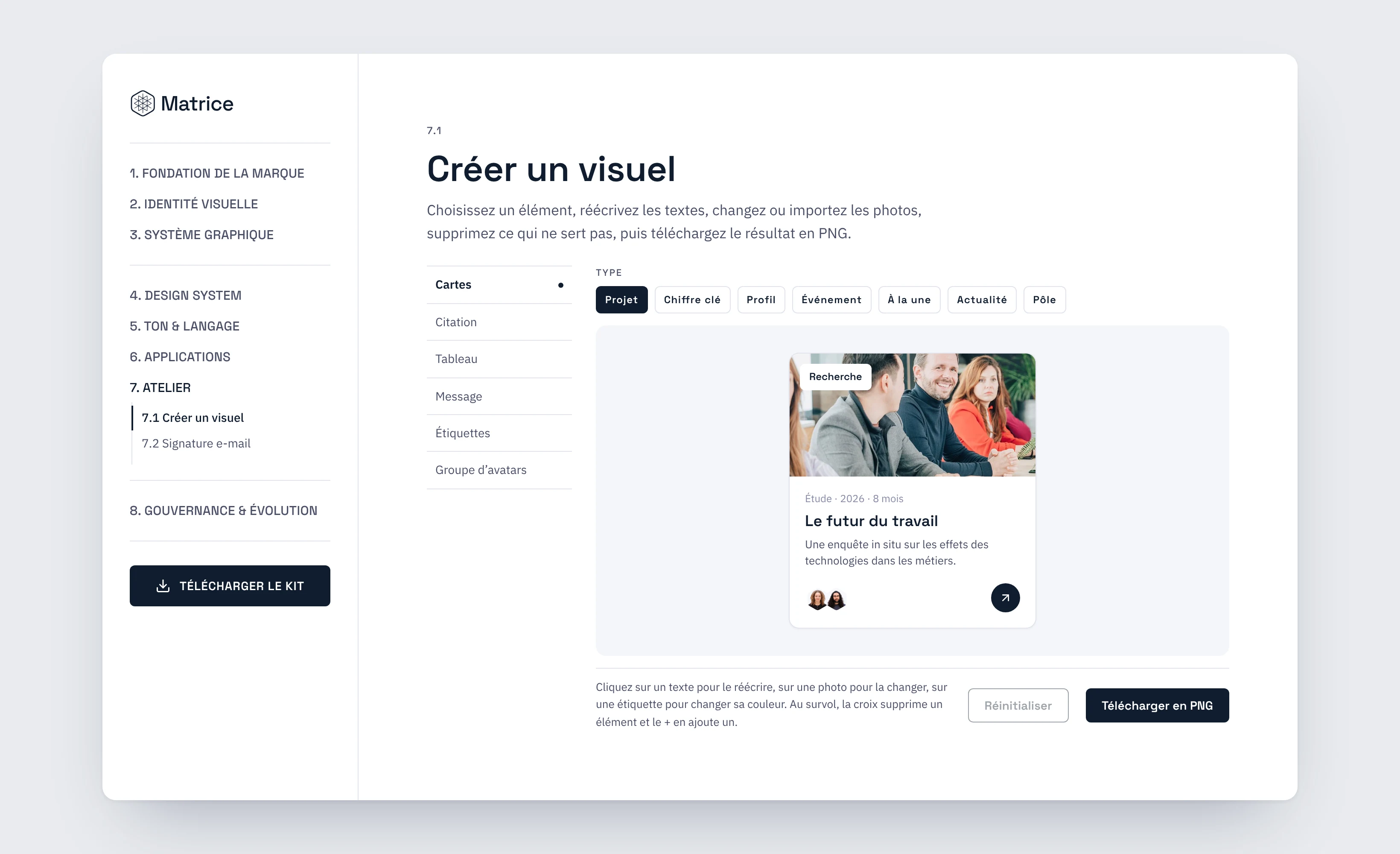
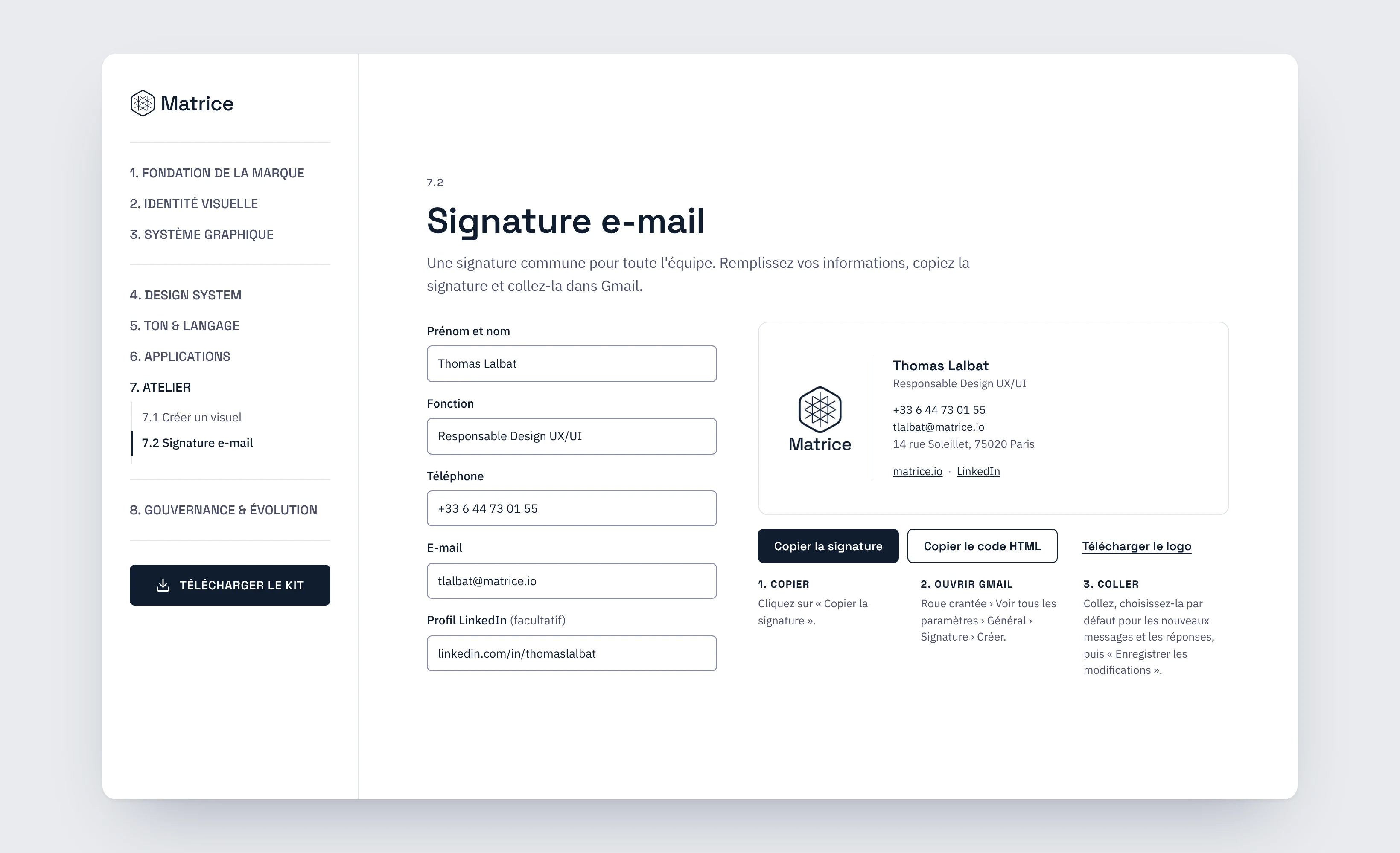
A full chapter built for the whole team: pick an element, rewrite the text, swap or upload photos, remove what isn't needed, then download the result as a PNG. The email signature is generated here too, in three steps all the way to Gmail.
customizable elements: cards, quote, table, message, labels, avatar group
card templates: project, key figure, profile, event, featured, news, team
design software needed, the PNG export runs in the browser
Adopted by the team.
What I take away.
A rule without a tool isn't followed
Adoption comes from what you can do right away, not from what you have to read.
Designing for non-designers
Copy, download, preview: every action has to be obvious.
What I'd do again
Launch the studio from the very first version. It's the tools, more than the rules, that got the guidelines adopted.